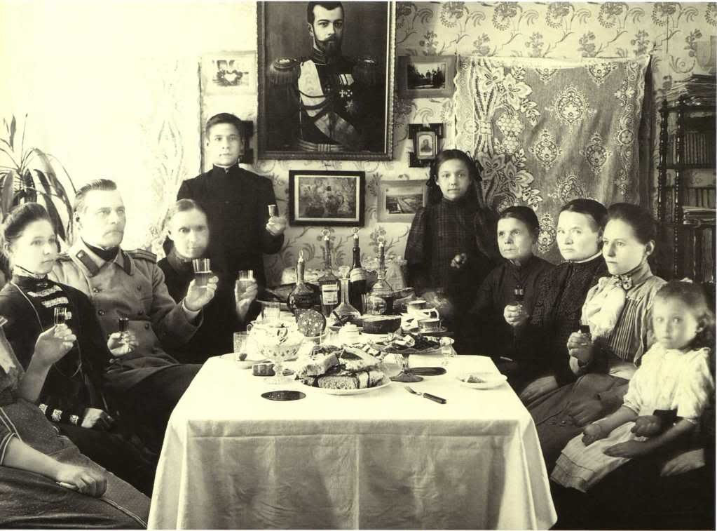

Or, what title would you give to a post that would publish just the two photos of these two different Russian New Year’s Eve dinners in a row, without a word?
Do you feel the world represented by one of the pictures better than the other? Would you prefer to live in one or the other? Do you see any kind of moral development/regress in the sequence of the two, and if so, what?
What logical relation do you project between the two pictures? A temporal one? It was like this, it became like this? If so, what kind of story do they describe? Or rather a parallel, a counterpoint? While those so, these so? If yes, which picture represents those and which one these?
And what do you think, if someone put up the two pictures in a post, what would he want to suggest with them?
And now look with absolutely fresh eyes at two completely different pictures about two very different feasts.
Put yourself the same questions.
Does the order of the pictures influence your answers? Do you identify more with the one you see first, or with the one following it as a counterpoint or punch line? Did the one which was more sympathetic earlier become now more alien to you?
The simple grammar, which is there, without exception, in the serving of every picture presented to your eyes, and which is so convincing not only because it is largely governed by subconscious conventions, but also because its actual generation is mainly your job, is especially useful to be made explicit in today’s times.


3 comentarios:
In the Hungarian version of the post a commenter noted that there is a separate literature on the problem that if two people want to convince the audience about their opinion, which is better, to speak first or second. Or, even more important, how one should argue when being the first or the second speaker.
That’s right. This whole topic, the persuasion, visual language, psychology of propaganda/advertisement has a huge litrature. It is not this what I try to pass in this single blog post. I only want to draw the attention of the readers in this blog, which so often deals with visual propaganda, how we are accustomed to accept as evidence such logical links, which are suggested to us through cleverly assorted pictures.
The question of sequence is only one of the tools, in the above post it only plays a secondary role, I only adopt it as a counter-test. It is much more important to reflect on the questions put before it, and to make explicit, from how many possible alternatives you usually choose – and usually unconsciously – your answers.
If only for the Kulechov Effect, we should say that the sequence of the images changes the feeling : in the second proposition, people on the oldest photo look really sad and depressed (as if they were attending a funeral meal) though on the first they just seemed serious and concerned, certainly praying. I am not sure the more recent picture changes so much.
There are certainly two worlds in these images even if the tea, the cakes and the alcohol are on both tables. More than the way people are dressed or undressed, more than the naked wall opposed to the full enhanced one, more than the darkness or the light, what strikes me is the new distance offered by the possession of one's camera : you pass from an external and cold (maybe historical) observation to an empathic one, from the inside. What the most recent one lacks — that you can find in the oldest one, details, precision, strangeness too and strength and a fine sensation of quiet awaiting in a pending time — is balanced by the cheerful looks and the warmth of the faces. Not only distant in years but maybe also in places : Northern Russia against Southern ?
Anyway, you could write good stories about both pictures.
I am invited into one of the pictures; in the other I am just a spectator. It has to do, I think, with the relationship of the photographer to the event in the photographs.
One picture, made with bright daylight streaming in from the upper left, is rigid and formal, and even has a certain air of unhappiness about it. It is possible that a photographer has been invited in on the occasion to make a family portrait. He arranges the subjects, clears the space from the nearest end of the table, in order to give the heavy tripod-mouted box camera a clear view of all the faces. “Hold still,” he says, so that the slow photograpic plate could capture the image with sharpness. The small child on the right seems to have shifted slightly during the exposure; his face is a bit blurred.
In the other, the photographer seems to be a guest at the party. He happens to have a camera. “I’m going to take a picture,” he says, and everybody looks toward him; some move around the table to get into the frame. He uses an amateur camera and only the available light, a ceiling lamp that makes the shadows under brows, noses, and chins look dark and heavy. Still, we take the photographer’s place when we look at the image. We are part of the proceedings, an invited guest -- not a clinical or professionally detached observer.
There is a historical progression in the images. The story in the first pairing is says, “That was then, this is now.” The second is more like, “Here we are, remember how we used to be?” Something could easily be read into the changes in social standing that (if we think in narrative terms) “took place” between the two images. The unhappy ones are wealthy, the less weathly here are a bit happier. Some might say material decline is an opportunity for moral advance; but we know it doesn’t always work out that way. Regardless, I know which party I’d rather attend!
Publicar un comentario